Genesis of the SUTRA armchair
JEAN-SEBASTIEN BLANC, associate designer STUDIO 5.5
The SUTRA collection is designed by Studio 5.5, why a collective instead of a Designer?
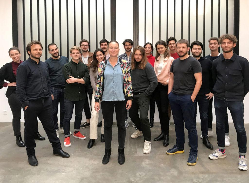
Jean-Sébastien Blanc : We are a group of designers! That is, since 2003, we are many creative talents working under the same name. The Studio 5.5, more than a style or “label” worn by an individual it is a generational mindset. We seek to create products that meet our needs and sharing of ideas, the encounter of divergent points of view, define this collective intelligence needed to design for the highest number of people.
In the process of creation, can we talk about collaboration with EGO Paris?
Yes absolutely! In my opinion, this is a textbook case of a collaboration between a manufacturer and a studio of design. It’s been almost 3 years since we met, and the desire to develop new products together does not weaken.
Today, everyone is free to argue their positions with a great mutual trust. Products are emerging naturally and gradually as we are exchanging, whether it’s around a prototype in the factory, in video or simply by text.
Were the lines of the SUTRA collection obvious to decline?
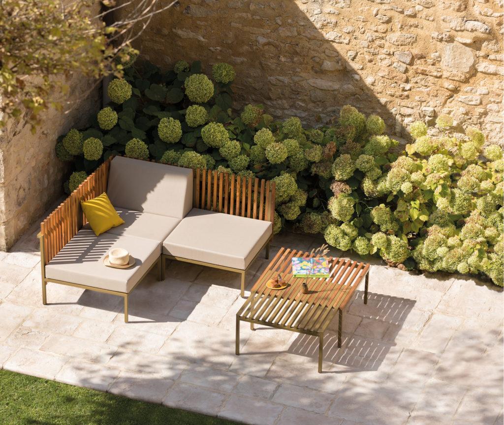
The primary inspiration for the SUTRA collection came from the observation of the “Ganivelles”, these famous beach wood fences that protect the dunes along the beaches. Very rhythmic vertical lines that can be found on the back of the SUTRA seating modules.
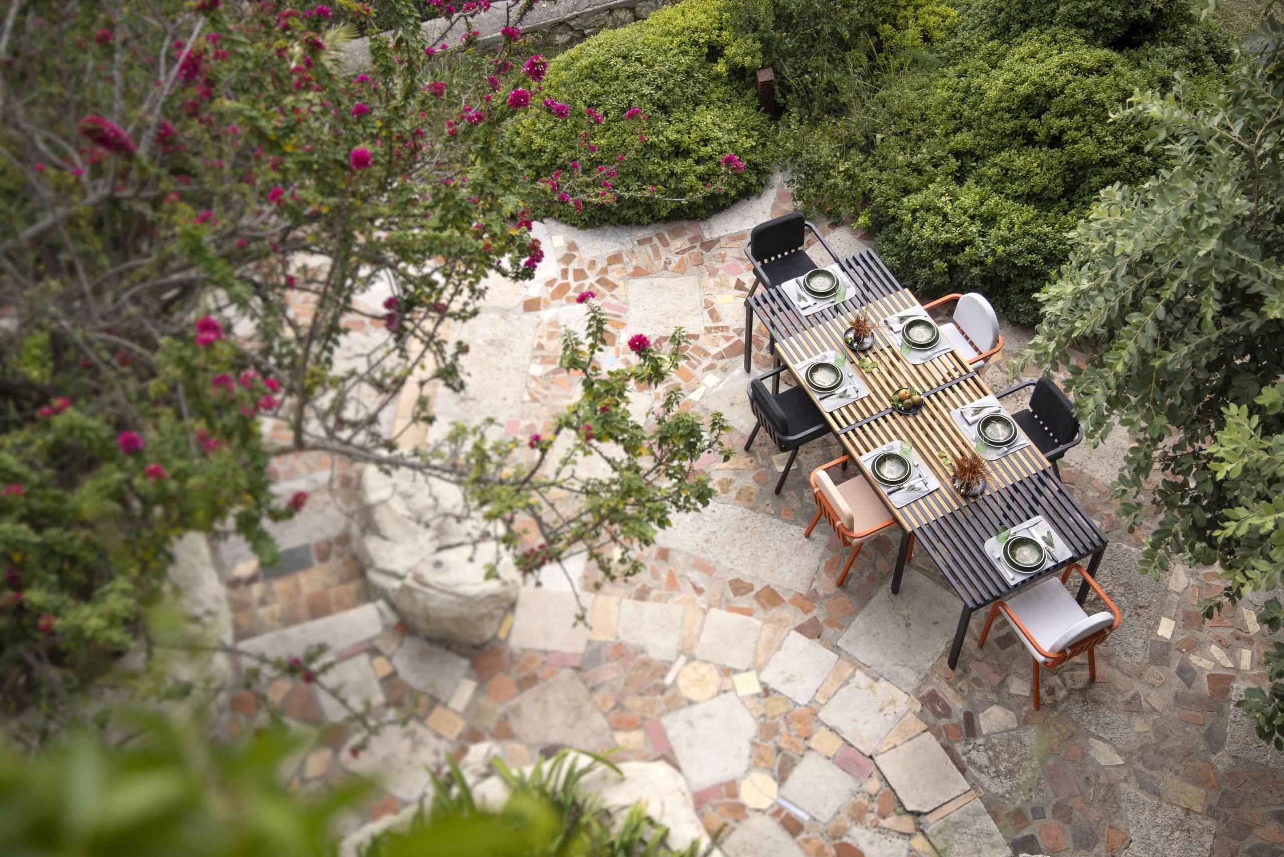
More than a line, the SUTRA collection is distinguished by its intelligence of use, each item is designed to decorate and also live its outdoor space. The most emblematic object of the collection is, according to me, the coffee table with its variable geometry. It doubles its surface thanks to a simple movement, with a game of bi-material comb. The result is a very graphic line made up of full and empty that we used to draw the various references of the collection and especially the armchair.
The section of the square profile that we use systematically also contributes to this homogeneity between all the pieces composing the Sutra collection.
In a more comprehensive manner, we sought to draw a seat that is fully in line with the garden armchairs. The best known being in our mind, the famous white plastic armchair says « Grosffilex ». A popular icon that we all remember, so important was its diffusion. Today this chair is no longer popular, it is certainly economic, it is not always very elegant but it is especially of low quality, which no longer corresponds to the challenges of our time. But this object has defined according to us, by its proportions, a form of archetype of garden armchair and it is by revisiting it in a more refined, more comfortable version and especially more durable than we created the Sutra armchair.
What are the “technical” and “usage” constraints that a Designer must comply with when designing a chair or an armchair?
Honestly, even if the chair meets a rather primary use, it is a subject of high complexity. A subject that can even become paralyzing for a designer so there are models of chairs on this earth. In my opinion, a chair is never created by chance.
It is often said that the history of design could be told through the history of chairs.
They are often the support of a technological advance, the demonstrators of the potential of a new material and the associated implementation process. They can also be the testimony of new behaviours and new ways of living our environment.
More specifically, there is evidence, of course a chair should be comfortable and not hurt the back. However, that’s not all! Today, a chair must also be functional, lightweight, stackable and durable.
Today we can’t just have fun with a nice line, beautiful thicknesses of material, without assessing the impact on the energy required for its production and consequently its impact on the environment. And it is this balance between purely aesthetic choices and feasibility considerations that we must arbitrate as designers.
Why did you first think of drawing an armchair before a chair?
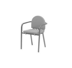
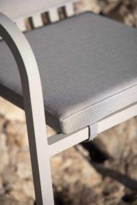
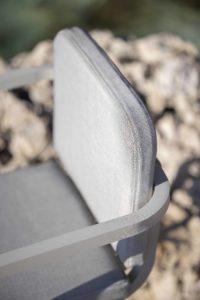
We were looking for a seating solution that was more comfortable than a simple garden chair. It was important for us to be able to draw the cushions at the early stage because they are often optional and very rarely integrated into the design of the object.
To meet this objective, it seemed important to us to offer armrests to rest his elbows and it is this point that makes the difference between an armchair and a chair. The chair is also part of the collection but it actually arrived as a variation of the armchair.
Why did you choose a low backrest?
We opted for a low backrest for only one and good reason is that we absolutely wanted the “front” feet to fit in the continuity of the line of armrests. And it was important to us that the chairs could be stowed under the table.
Therefore, the backrest is lower than a classic chair but this is what gives this chair a singular character and a certain lightness in its design. The cushion of the backrest restores height to the chair without preventing its storage.
How did you come up with the idea of offering different shapes of cushions for the backrest?
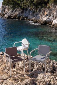
In total transparency, we hesitated between these three forms of cushions: the perfect square, the rounded square and the arch. The impact on the overall design of the chair was enormous and each version had its legitimacy and interest. In the studio, man often say that choosing is giving up … and we really couldn’t decide, the arguments were all too subjective in the face of purely stylistic considerations. The idea of offering a range of cushions appeared as the solution.
We like the idea that people can appropriate their furniture, even with an impact on the design. And this is one of the particularities of the brand EGO Paris. This idea that people were going to be able to play with colours, finishes and even shapes, in a logic of personalization, fits perfectly into our work. You can create your own style, playing with the colours of the cushions but also with the shapes from one chair to another, which breaks with the monotony of a series of aligned chairs.
How does the design of this armchair make it timeless?
It is always difficult to make progress on this subject, because only time will tell if we have managed to create a chair that fits into the duration. What is certain, is that we did not try to include it in the current trend and we have not added anything superficial that could mark its time. Unfortunately, it is often the design, in the «aesthetic» sense, that dates the objects and makes objects obsolete when trends change.
The design of this chair is the result of a desire to create an object of great design intelligence, that fills its use without imposing itself. In this sense, it seems to me that it has everything to become a timeless armchair, especially since its manufacturing quality will allow it to go through the test of time in complete serenity.


